
Memoria
Lorem ipsum dolor sit amet, consectetur adipiscing elit, sed do eiusmod tempor incididunt ut labore et dolore magna aliqua. Ut enim ad minim veniam, quis nostrud exercitation ullamco laboris nisi ut aliquip ex ea commodo consequat.

Receta
Item 1
This is some placeholder content for the scrollspy page. Note that as you scroll down the page, the appropriate navigation link is highlighted. It's repeated throughout the component example. We keep adding some more example copy here to emphasize the scrolling and highlighting.
Item 2
This is some placeholder content for the scrollspy page. Note that as you scroll down the page, the appropriate navigation link is highlighted. It's repeated throughout the component example. We keep adding some more example copy here to emphasize the scrolling and highlighting.
Item 3
This is some placeholder content for the scrollspy page. Note that as you scroll down the page, the appropriate navigation link is highlighted. It's repeated throughout the component example. We keep adding some more example copy here to emphasize the scrolling and highlighting.
Item 4
This is some placeholder content for the scrollspy page. Note that as you scroll down the page, the appropriate navigation link is highlighted. It's repeated throughout the component example. We keep adding some more example copy here to emphasize the scrolling and highlighting.
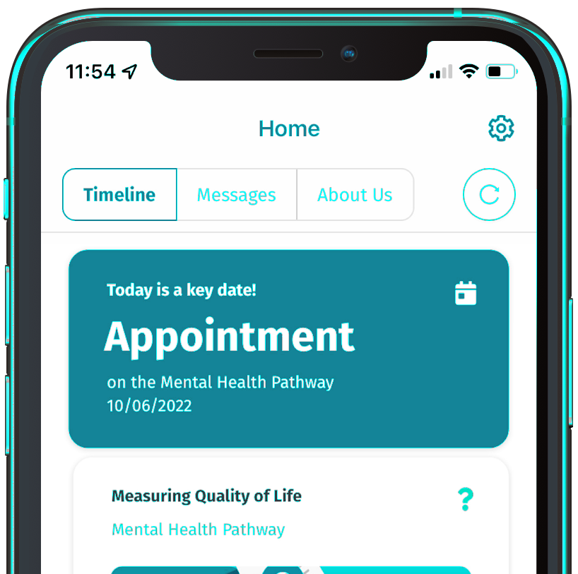
Centered screenshot
Quickly design and customize responsive mobile-first sites with Bootstrap, the world most popular front-end open source toolkit, featuring Sass variables and mixins.
hand_gesture
Heading
Some representative placeholder content for the three columns of text below the carousel. This is the first column.
approval_delegation
Heading
Another exciting bit of representative placeholder content. This time, we've moved on to the second column.
fingerprint
Heading
And lastly this, the third column of representative placeholder content.
First featurette heading. It’ll mind.
Some great placeholder content for the first featurette here. Imagine some exciting prose here.
This is the first item's accordion body. It is shown by default, until the collapse plugin adds the appropriate classes that we use to style each element. These classes control the overall appearance, as well as the showing and hiding via CSS transitions. You can modify any of this with custom CSS or overriding our default variables. It's also worth noting that just about any HTML can go within the
.accordion-body, though the transition does limit overflow.
This is the second item's accordion body. It is hidden by default, until the collapse plugin adds the appropriate classes that we use to style each element. These classes control the overall appearance, as well as the showing and hiding via CSS transitions. You can modify any of this with custom CSS or overriding our default variables. It's also worth noting that just about any HTML can go within the
.accordion-body, though the transition does limit overflow.
This is the third item's accordion body. It is hidden by default, until the collapse plugin adds the appropriate classes that we use to style each element. These classes control the overall appearance, as well as the showing and hiding via CSS transitions. You can modify any of this with custom CSS or overriding our default variables. It's also worth noting that just about any HTML can go within the
.accordion-body, though the transition does limit overflow.
Receta

Oh yeah, it’s that good. See for yourself.
Another featurette? Of course. More placeholder content here to give you an idea of how this layout would work with some actual real-world content in place.